效果展示
完整源码
<!DOCTYPE html>
<html lang="en" >
<head>
<meta charset="UTF-8">
<title>3D旋转时间轴</title>
<link rel='stylesheet' href='https: //cdnjs.cloudflare.com/ajax/libs/font-awesome/4.7.0/css/font-awesome.min.css'>
<link rel="stylesheet" href="css /style.css">
</head>
<body>
<!-- partial:index.partial.html -->
<!-- Start Timeline -->
<section id= "timeline">
<ul class= "line">
<li>
<div class="cont">
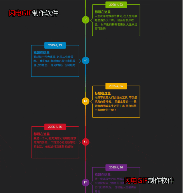
<h3>标题在这里</h3>
<p> 人生决非是飘渺的梦幻, 在人生的原野里洒多少汗珠, 就会有多少收益。 对辛勤的耕耘者来说 人生永远是可爱的. </p>
<time>2025 4, 22</time>
</div>
</li>
<li>
<div class="cont">
<h3>标题在这里</h3>
<p> 要成就一件大事业, 必须从小事做起。 我们每日每时都必须注意培养自己的意志, 任何时候,任何地方. </p>
<time>2025 4, 23</time>
</div>
</li>
<li>
<div class="cont">
<h3>标题在这里</h3>
<p> 书籍不仅是人们交往的工具, 不仅是讯息的传播者, 而最主要的——是洞察周围现实生活的工具 是自然界中有理智的一份子. </p>
<time>2025 4, 24</time>
</div>
</li>
<li>
<div class="cont">
<h3>标题在这里</h3>
<p> 要是一个人, 能充满信心地朝他理想的方向去做, 下定决心过他所想过的生活, 他就会得到意外的成功. </p>
<time>2025 4, 25</time>
</div>
</li>
<li>
<div class="cont">
<h3>标题在这里</h3>
<p> 使一些非理性的东西服从于自己, 自由地按照自己固有的规律去驾驭一切飞行的东西, 这就是人类最终目的地. </p>
<time>2025 4, 26</time>
</div>
</li>
</ul>
</section>
</body>
</html>
@import url('https://fonts.googleapis.com/css?family=Montserrat');

* {
	margin: 0;
	padding: 0;
	border: 0
}

body {
	font-family: 'Montserrat', sans-serif;
	overflow: hidden
}

ul {
	list-style: none
}

/*--------------------------------------------            #Start Timeline Rules--------------------------------------------*/
#timeline {
	width: 100%;
	height: 1120px;
	background-color: #222223;
	padding: 20px 1%;
	overflow: hidden
}

#timeline ul {
	min-height: 950px;
	border-top: 0;
	border-left: 4px solid transparent;
	border-left-color: #7ab800;
	/* Fullback */
	-webkit-border-image: -webkit-linear-gradient(top, #7ab800 0%, #0085c3 35%, #f2af00 50%, #ce1126 65%, #6e2585 100%);
	-moz-border-image: -moz-linear-gradient(top, #7ab800 0%, #0085c3 35%, #f2af00 50%, #ce1126 65%, #6e2585 100%);
	-ms-border-image: -ms-linear-gradient(top, #7ab800 0%, #0085c3 35%, #f2af00 50%, #ce1126 65%, #6e2585 100%);
	-o-border-image: -o-linear-gradient(top, #7ab800 0%, #0085c3 35%, #f2af00 50%, #ce1126 65%, #6e2585 100%);
	border-image: linear-gradient(top, #7ab800 0%, #0085c3 35%, #f2af00 50%, #ce1126 65%, #6e2585 100%);
	border-image-slice: 1;
	position: relative;
	top: 5%;
	left: 50%;
	perspective: 2000px
}

#timeline ul li:after {
	content: "\2713";
	font-family: fontawesome;
	display: block;
	width: 35px;
	height: 35px;
	border-radius: 50%;
	font-weight: 100;
	font-size: 90%;
	line-height: 35px;
	text-align: center;
	background-color: #7ab800;
	color: #fff;
	position: absolute;
	-webkit-transition: transform 1s linear;
	transition: transform 1s linear
}

#timeline ul li:nth-child(2):after {
	background-color: #0085c3;
}

#timeline ul li:nth-child(3):after {
	content: "\f11d";
	background-color: #f2af00;
}

#timeline ul li:nth-child(4):after {
	content: "\f11d";
	background-color: #ce1126
}

#timeline ul li:last-child:after {
	content: "\f11d";
	background-color: #6e2585
}

#timeline ul li .cont {
	width: 200px;
	height: 110px;
	padding: 25px 10px 10px;
	border: 2px solid transparent;
	border-radius: 4px;
	-webkit-transform: translate(0, -55px);
	transform: translate(0, -55px);
	text-transform: capitalize;
	line-height: 150%;
	font-size: 80%;
	font-family: 'Montserrat', sans-serif;
	position: absolute;
	top: 22px
}

#timeline ul li:nth-child(odd) .cont {
	-webkit-transform-origin: left;
	transform-origin: left;
	-webkit-transition: transform 1.5s linear;
	transition: transform 1.5s linear
}

#timeline ul li:nth-child(even) .cont {
	-webkit-transform-origin: right;
	transform-origin: right;
	-webkit-transition: transform 1.5s linear;
	transition: transform 1.5s linear
}

#timeline ul li:first-child .cont {
	color: #7ab800
}

#timeline ul li:nth-child(2) .cont {
	color: #0085c3
}

#timeline ul li:nth-child(3) .cont {
	color: #f2af00
}

#timeline ul li:nth-child(4) .cont {
	color: #ce1126
}

#timeline ul li:last-child .cont {
	color: #6e2585
}

#timeline ul li:nth-child(odd):hover .cont {
	text-align: left;
	-webkit-transform: rotateY(-175deg) translate3d(60px, -50px, 5px);
	transform: rotateY(-175deg) translate3d(60px, -50px, 5px);
	-webkit-transition: transform 1.5s linear;
	transition: transform 1.5s linear;
}

#timeline ul li:nth-child(even):hover .cont {
	text-align: left;
	-webkit-transform: rotateY(175deg) translate3d(-60px, -50px, 5px);
	transform: rotateY(175deg) translate3d(-60px, -50px, 5px);
	-webkit-transition: transform 1.5s linear;
	transition: transform 1.5s linear
}

#timeline ul li:nth-child(odd):hover .cont p,
#timeline ul li:nth-child(odd):hover .cont h3 {
	-webkit-transform: rotateY(-175deg);
	transform: rotateY(-175deg)
}

#timeline ul li:nth-child(even):hover .cont p,
#timeline ul li:nth-child(even):hover .cont h3 {
	-webkit-transform: rotateY(175deg);
	transform: rotateY(175deg)
}

#timeline ul li:nth-child(2) .cont time {
	background-color: #0085C3
}

#timeline ul li:nth-child(3) .cont time {
	background-color: #F2AF00
}

#timeline ul li:nth-child(4) .cont time {
	background-color: #CE1126
}

#timeline ul li:last-child .cont time {
	background-color: #6E2585
}

#timeline ul li:nth-child(odd):hover .cont time {
	-webkit-transform: rotateY(-175deg);
	transform: rotateY(-175deg)
}

#timeline ul li:nth-child(even):hover .cont time {
	-webkit-transform: rotateY(175deg);
	transform: rotateY(175deg)
}

#timeline ul li .cont p {
	display: block
}

#timeline ul li:nth-child(n+1):after {
	left: -18px
}

#timeline ul li:first-child:after,
#timeline ul li:first-child .cont {
	top: 8%
}

#timeline ul li:nth-child(2):after,
#timeline ul li:nth-child(2) .cont {
	top: 28%
}

#timeline ul li:nth-child(3):after,
#timeline ul li:nth-child(3) .cont {
	top: 48%
}

#timeline ul li:nth-child(4):after,
#timeline ul li:nth-child(4) .cont {
	top: 68%
}

#timeline ul li:last-child:after,
#timeline ul li:last-child .cont {
	top: 88%
}

#timeline ul li:nth-child(n+1):hover:after {
	-webkit-transform: rotateZ(360deg);
	transform: rotateZ(360deg);
	-webkit-transition: transform 1s linear;
	transition: transform 1s linear
}

#timeline ul li:first-child .cont {
	border-color: #7ab800
}

#timeline ul li:nth-child(2) .cont {
	border-color: #0085c3
}

#timeline ul li:nth-child(3) .cont {
	border-color: #f2af00
}

#timeline ul li:nth-child(4) .cont {
	border-color: #ce1126
}

#timeline ul li:last-child .cont {
	border-color: #6e2585
}

#timeline ul li:nth-child(odd) .cont {
	left: 30px
}

#timeline ul li:nth-child(even) .cont {
	left: -255px
}

#timeline ul li .cont:before,
#timeline ul li .cont:after {
	content: "";
	display: block;
	width: 0;
	height: 0;
	position: absolute;
	border-style: solid;
}

#timeline ul li:nth-child(odd) .cont:before {
	border-width: 11px 11px 11px 0;
}

#timeline ul li:nth-child(even) .cont:before {
	border-width: 11px 0 11px 11px
}

#timeline ul li:nth-child(odd) .cont:after {
	border-width: 10px 10px 10px 0
}

#timeline ul li:nth-child(even) .cont:after {
	border-width: 10px 0 10px 10px
}

#timeline ul li:nth-child(odd) .cont:before {
	top: 50%;
	left: -11px;
	-webkit-transform: translate(0, -50%);
	transform: translate(0, -50%)
}

#timeline ul li:nth-child(even) .cont:before {
	top: 50%;
	right: -11px;
	-webkit-transform: translate(0, -50%);
	transform: translate(0, -50%)
}

#timeline ul li:first-child .cont:before {
	border-color: transparent #7ab800 transparent transparent
}

#timeline ul li:nth-child(2) .cont:before {
	border-color: transparent transparent transparent #0085c3
}

#timeline ul li:nth-child(3) .cont:before {
	border-color: transparent #f2af00 transparent transparent
}

#timeline ul li:nth-child(4) .cont:before {
	border-color: transparent transparent transparent #ce1126
}

#timeline ul li:last-child .cont:before {
	border-color: transparent #6e2585 transparent transparent
}

#timeline ul li:nth-child(odd) .cont:after {
	border-color: transparent #222223;
	top: 50%;
	left: -9px;
	-webkit-transform: translate(0, -50%);
	transform: translate(0, -50%)
}

#timeline ul li:nth-child(even) .cont:after {
	border-color: transparent #222223;
	top: 50%;
	right: -9px;
	-webkit-transform: translate(0, -50%);
	transform: translate(0, -50%)
}

#timeline ul li .cont time {
	width: 100px;
	height: 30px;
	position: absolute;
	top: -15px;
	left: calc(100%/2 - 50px);
	background-color: #7AB800;
	color: #f5f5f5;
	line-height: 30px;
	text-align: center;
	border-radius: 3px
}

.copy-right {
	color: #7AB800;
	text-align: center;
	text-transform: uppercase;
	padding: 130px 0 20px
}

.copy-right a {
	color: #0085C3;
	text-transform: capitalize
}

@media screen and (max-width: 600px) {
	#timeline ul li .cont {
		width: 120px;
		line-height: 120%
	}

	#timeline ul li:nth-child(even) .cont {
		left: -175px
	}

	#timeline ul li .cont p,
	#timeline ul li .cont time {
		font-size: 76%
	}

	#timeline ul li .cont time {
		width: 80px;
		left: calc(100%/2 - 40px)
	}
}

/*-------------------------------------         #End Timeline Rules-------------------------------------*/